Below is the link to my YouTube video upload of generic conventions of horror film websites
https://youtu.be/o_qlZCmDhVA
The transcript of my research is pasted below in case some of the red text is hard to read:
Conventions of Horror Film Websites
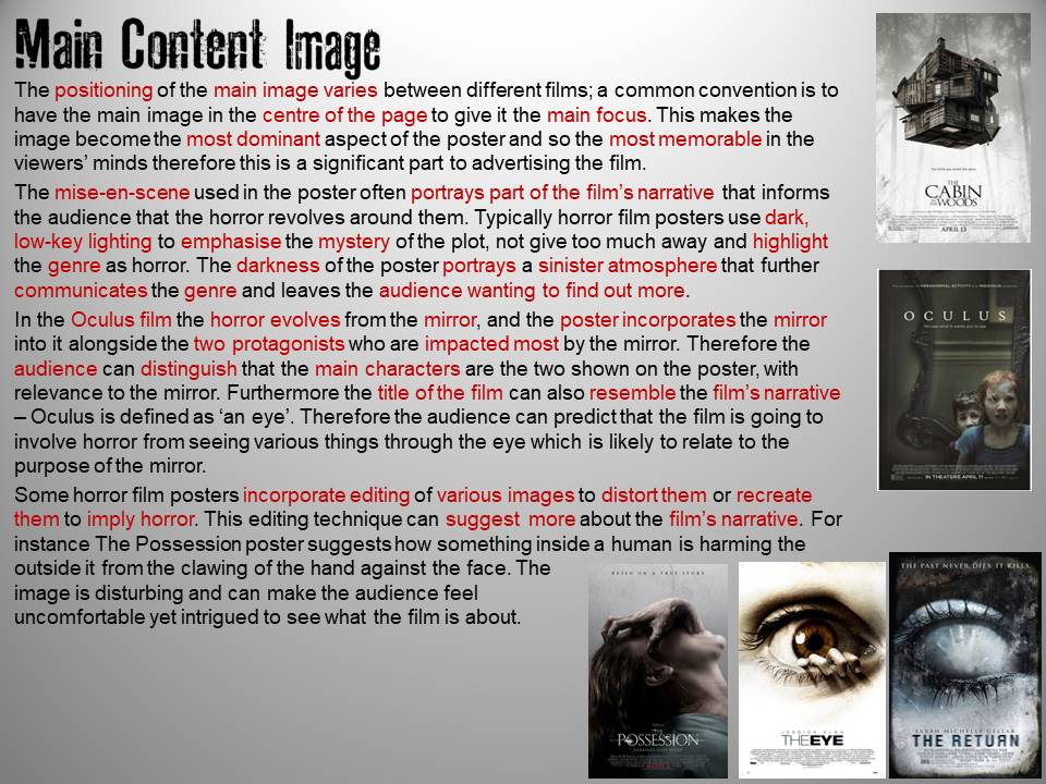
For a horror film website to be successful among its audience it needs to be interactive and contain multi-media features. This is completed by having navigation links to various pages to navigate around the site and including videos, images, graphics, text and sounds.
Navigation
Typically the navigation bar or buttons are at the top of the homepage so that when the page is first opened the audience can instantly see what pages are available to look further into to gain more information about the film. However it is also common for the navigation bar to be down the side of the page, like on the Conjuring 2 website.
It is conventional for horror film websites to have the content pages of cast information, gallery, videos, the trailer and a synopsis, some even have games. There are various ways of users distinguishing what the hyperlinks on the page are; the hyperlinked content might be in a button that makes it clear that you can click it to navigate you to another page, or when the cursor is placed over the text it is likely to increase in size or become bolder, or the text might change colour to highlight the text. The font style of the text used throughout the website for the headings and text is a simplistic font so that it is easy to read. To maintain communicating the genre, some horror film websites make the hyperlinked text/buttons change colour to red to symbolise blood and gore with an effect of flickering, shaking or dripping. Furthermore sounds are sometimes incorporated when the hyperlinks are clicked to enhance the horror further and create a surrounding feel upon the user.
Multimedia Features
The various multi-media used within horror film websites conventionally includes sounds or music playing as soon as you open up the website to immediately create an eerie atmosphere for the user. This continues playing on repeat therefore making it constant on the users mind to maintain the scariness of the film. There is often an option to mute the sound on the website for those who may find it too disturbing or irritating having it play over and over again. Furthermore some might find it hard to concentrate on reading the text with background music playing. Another conventional feature of using sound with the website is when clicking on a hyperlink. This again maintains horror from the film by creating a surrounding around the user that makes them feel more involved and interactive with the site. Therefore they are focused and do not lose interest when using the website as the sounds keep them alert.
The use of moving video content and animated features also maintains the users’ attention because their eyes will always be directed to the moving parts. Additionally this incorporates a range of features so that the audience are engaged and interested as just having text and still images can be boring to look at and read from therefore including interactive features and animations ensures that the users are always fascinated and attentive.
Having text is important to ensure enough information is provided however having too much information can become tedious and mind-numbing for the audience to read whereby they stop taking in information because there is so much to process. Consequently delivering the information in various ways through video content, games and graphics enables information to be included in a more presentable manor whereby the audience are more interested to engage with it.
Background
The background of horror film websites typically are a dark colour or content from the film, like an image or even video content running in the background like on the Insidious website. On the Annabelle website the background appears black however when you move the mouse cursor around the page the Annabelle doll is revealed through a torch light. This helps to connote the genre of the film as well as maintaining consistency throughout all the film material.
Film Title
Similarly with the poster, the title of the film has been made the largest and most prominent so that the audience can clearly see that the website they have visited is of the film. The font style is the same to maintain consistency throughout the material of the film so that the audience can identify that this is the film’s house style. It is also conventional for the title to be situated centrally on the page as this enables the film to be recognised instantly as attention is drawn there. However it is common to be situated on the top left of the page as people typically read from left to right, top to bottom, and so will notice the title first. It is conventional to use a contrasting colour of white against the black background because this makes it clear to read and stand out from the rest of the page. This could also connote the binary opposite to symbolise the good and evil within the film which portrays the genre as horror.
Institutional Information
Likewise with the poster the institutional information is situated at the bottom of the page as this is not a key advertising method to selling the film. It is included to give acknowledgement and credit to the companies and people involved in funding and producing the film. Again its font size is small so that it does not overwhelm the bottom of the page yet is still noticeable and readable. An alternative way of including this information is having the private policy, terms of use, and credits at the bottom of the page where users will have to click on the hyperlinked text to find out more, like on the Annabelle website shown in the video below. This way the credit block does not take up too much of the page.
Social Media
A conventional element of horror film websites are the use of social media links. This helps to advertise the film further as the audience can share the film related material to friends and family on the various social media sites. This enables the film to be more widespread over different audiences as social media is used widely every day in addition to being almost like free advertisement for the producers as awareness is spread through online word-of-mouth.
Targeting the Audience
Having a website that is easy to navigate around is normally significant to maintaining the target audiences’ attention as this avoids them becoming frustrated and agitated, and not want to use the website. Making the navigation bar text change colour or highlighted in some way that makes it clear that, that is the page being viewed enables the audience to be aware of the page they are on and choose a different one when they have finished on that page. Similarly they know which page they are about to click on because when the cursor is over the hyperlinked text, it creates sound, moves or changes colour to again differentiate it from the other navigation links.
Incorporating aspects of the film like the sounds, graphics, videos and images enables them to connect with the film more than simply watching it. If they have already expressed interest in the film or poster it is likely that they have visited the website because they are intrigued from the theme and styles used. Therefore the theme and style of the website needs to be maintained with the house style, to ensure that they are still fascinated and want to find out more. Including various entertaining aspects to the site like exclusive footage, information about the cast, photos and games further entices the audience into exploring the site because they cannot gain this information from anywhere else. This is likely to want them to share it with others which will help promote the film. Some horror films may have a book in addition to the film however people who have seen the films are likely to be more interested in graphic content that does not involve too much text or reading. Therefore including little amounts of text does not overwhelm the audience, and so maintains their attention. Too much text is likely to appear boring, tiresome and uninteresting to them, resulting in them not wanting to visit the site. This is likely to negatively impact the reputation of the film and so the overall views and sales.
Having all the relevant film content incorporated into one website makes it easier for the audience to discover more about the film as less researching using search engines is needed as it is all in one site. Even content that might lead to a new tab can still be found on the website which makes it easier and more convenient for the audience as again it means less searching needed elsewhere. For instance looking up film related content on social media or purchasing merchandise, this could be hyperlinked on the website so that the audience do not have to make an independent search elsewhere, this will direct them straight to the official content.
Advertising the film & Merchandise
All the content on the website will be related to the film either by including scenes from the film or simply the characters dressed as they were in the film.
On the Woman In Black website, it even includes a hyperlinked image to the DVD of the film. This promotes the hard copy version of the film which is available for the audience to buy. Alternatively advertising when the film will be in cinema further advertises the film. It is common for the websites to include reminders or links to pre-book tickets.
Including the social media links throughout the website enables the film to be shared to a wider audience because the users of the website can navigate round the social media pages and share it with friends and family. This marketing technique is beneficial to the producers and companies involved in making the film because advertisement is produced through word-of-mouth meaning it is free for the producers to gain viewers and spread awareness.
Within the synopsis, or reviews that may be included on the website, further advertising of the film can be made through the language persuading people to watch the film. For example high-star ratings from critics or newspapers makes people more likely to want to watch the film because they believe if these organisations have rated it highly, then it must be a good film to see and is worth watching. Furthermore within the synopsis it is common to include language about the producer and/or director that helps sell the film. For instance on the Conjuring 2 website the phrase ‘record-breaking’ portrays that the previous work has been a huge success implying that the following pieces are likely to also be a success and so make people want to watch the film.
Below is the link to my YouTube video upload of my Screencast-o-matic of the Insidious 2 website analysis:
https://youtu.be/uMJhuBdy8Uc
In case some of my speech is not clear, I have included transcript below:
When you first open up the Insidious 2 you
can instantly experience various multi-media, of sound, a flickering image and
having to interact with the page to enter the site. Using the words ‘enter
further’ implies that users are being offered time to consider if they want to
see further into the horror which further suggests how horrific the content
might be, so this is used to create a warning before being fully revealed to
the user.
Once the button has been clicked on, more
sound is produced to create an atmosphere of horror and reveals the homepage
where the navigation bar is at the top of the page with the title of the film
in the centre, alongside its caption and release information.
The navigation hyperlinks are illustrated in
a simplistic sans serif font whereby when the cursor is hovered over the text,
it changes colour and moves shakily. The font is used so that it is easy to read
yet maintains aspects of horror through the change of colour to red to
symbolise blood and violence, and making the text shake can portray uneasiness
and unnerving. Also sound is produced when the cursor is placed over the text
and when the hyperlink has been clicked on. All of which help communicate the genre of
the film and its theme. The pages of the navigation bar allow you to
navigate to the other pages of the website as the navigation bar remains on all
of the pages. So that the user knows what page they are
viewing, the text heading of the page remains in red with the shaking effect to
highlight that this is the current page being viewed. The content on this website is a synopsis of
the film, information about the cast and filmmakers, photos from the film,
videos, downloadable content and a game.
The institutional information is found at the
bottom of the page on all pages of the website. This gives credit and
acknowledgment to those involved in the film making and funding. There are
links to the private policy, terms of use, cookies, SonyPictures.net (the
producer and distributor) and worldwide release dates.
The social media links are here on the page
which helps advertise the film and merchandise because the use of the hashtag
can be used as a powerful marketing tool, which is vastly used in today’s
society and by the target audience. This can promote merchandise of the film
because the hashtag insidious can be used alongside the content on different
sites which enables users to find out more about the film or related material.
The colours used are conventional of the
horror genre of black, white and red. The black and white contrast with each
other making it easy for the audience to read, and the red contributes to an
additional contrast which is commonly associated with blood, anger and violence.
These are maintained throughout all the material related to the film, so in the
trailer and on the poster. Therefore, this will maintain the target audiences’
interest and desire to see the film. Making it easy to navigate the website
will attract the audience to make full use of the website because they will
remain interested and fascinated with the content without feeling frustrated at
a slow moving and confusing layout. Little text has been included which makes
it more enjoyable for the audience because it enables them to learn more about
the film without having to read too much information which can be tedious.
Overall the main multi-media features of this
site includes the sounds incorporated when the user interacts with the site,
having moving image content that maintains the audiences’ attention as well as
the photos and videos relating to the film helps attract the audience.
Below is a navigation map I have completed of the Insidious 2 website: