Wednesday, 29 November 2017

Film Trailer Props

For our film trailer Kirsty and I have gathered a range of props:
  • For the Ouija Board, I found a template online and painted the letters and numbers onto a wooden board with my father making the wooden spinner for it.


  • For the necklace, Emma found one of her old necklaces that Kirsty and I thought was fit for purpose.


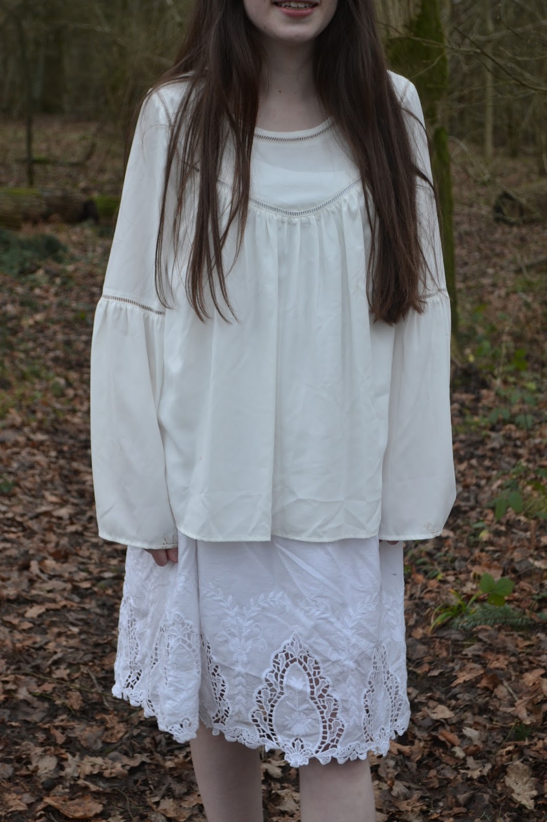
  • For the ghost outfit Kirsty bought a white dress and white blouse from a charity shop that looked effective for our use. 

  • For the scene of when Sylvia opens the parcel with the necklace inside, I managed to get some hearts and liver from the local butchers to put in the box so that the trailer includes some gore.


  • To create an eerie effect message on the bathroom mirror, we steamed up the bathroom and Kirsty used her finger to write the message on the mirror. 


Tuesday, 21 November 2017

Final Plan of Horror Film Webpage with Navigation Map

Below is a scanned in image of the plan of my Horror Film Homepage:


For the film title I am using the font choice of ‘diediedie’ because Kirsty and I chose this font together to fit the theme of the film as this will be consistent throughout all the film material. It will be used in the film trailer, on the poster and homepage.

For the navigation buttons text I am using 'Copyshop' because it is a simplistic font that is readable and slightly bolder than the release date text.

For the release date text I am using 'Source Serif Pro' because this is a simplistic readable font that the audience can easily read when the film will be released. Again this font is maintained on the poster and homepage to create consistency throughout.


I have included hyperlinked images of the main social media logos so that users can gain more information on these sites to help create a buzz as well as allowing them to share the information with friends and family which will further promote the film to a wider audience.


At the bottom of the page I have included the legal information hyperlinks of privacy policy, terms of use, cookies and the film credits. The font for this is 'Source Serif Pro' because this maintains consistency throughout the products whereby all the text is similar to one another so that it does not look messy and unprofessional. The text is located at the bottom of the page in a small font size  because this is not a key part of selling and promoting the film and so is not frequently used by viewers.


The main image will be of Chelsie stood centrally in the woods where she is surrounded by trees and fallen leaves. The image will be animated so that it shakes slightly so that the image is not still.


Below is the navigation map of my website:


Final Plan of Film Poster

Below is a scanned in image of the sketch I intend to follow when completing my Horror Film Poster:


For my poster I am using the font choice of ‘diediedie’ for the title of the film. Kirsty and I chose this font together as it will be used throughout our products for the film; in the film trailer, on the poster and homepage.


For the credit block font I am using the font ‘SF Movie Poster’ because this is a simplistic sans serif font that can help my credit block look realistic and professional like genuine movie posters.

For the release date text I am using the 'Source Serif Pro' font because this is a simplistic font that is easy for the audience to read, as well as it fitting with the overall poster appearance.

For the main image I have chosen a close up shot of Chelsie. This will be created using two images layered on top of one another. The main image will be of a still, blank looking Chelsie with wide eyes staring directly at the camera to portray direct address to the audience. This image will not have a mouth because this can reflect her screams are silent. The image layered onto this will be of Chelsie screaming in a very translucent colour so that it looks as though the image is of Chelsie screaming on the inside, hence why it is silent and no one can hear her to reflect the title of the film. 
I have also decided to include the necklace as part of Chelsie's accessory on the poster as this is a main part to the film as it reappears in the present life of Sylvia.
Chelsie's hair will take up most of the background of the frame, however a dark plain black background will be used so that all the main focus is on Chelsie's facial expression. Similarly her costume will be outside the frame, however if any is included it will be the top of her white blouse of the dress to resemble the ghostly figure as well as contrasting to the black background and her hair colour.

Wednesday, 8 November 2017

First Sketches of Inital Poster Ideas

To gather some ideas for my horror film poster I have sketched a range of posters.

The first poster has the title of the film located towards the bottom of the page with the release date underneath it with the credit block to follow. The main image content is the back view of the character Sylvia looking at a reflection of Chelsie, the dead friend taken from a medium-long shot. 

The second poster is a close-up of Chelsie looking deadly and traumatic with the impression of her screaming to symbolise the title of the film. Again the situation of the title is towards the bottom of the poster because the main image takes up most of the page. The 'Silent Hills' poster inspired me for this design. The release date and credit block is below the title as this is a conventional feature of horror film posters.

The third poster is a medium shot of the necklace belonging to Chelsie which reoccurs in the present day of Sylvia's life. The necklace is made to be floating on water which resembles the scene of the necklace floating in the bathtub, and Chelsie's death due to drowning. The top of the poster has the production name with the title of the film below it so that the audience see it from first looking at the poster. The release date and credit block is then located at the bottom of the poster to follow the conventional feature of horror film posters.

The fourth poster is a long shot of the forest setting with Chelsie in the middle-ground, similar to the final scene of the trailer. The title of the film is located at the top of the poster with the release date and credit block at the bottom of the poster. This way the title fills the empty space of the poster of the sky that does not have much impact in selling the poster as the main content is the forest and character. 

From audience feedback I have decided to go with the second poster of the close-up of Chelsie because the focus group liked the idea of the image reflecting the title of Chelsie screaming.


Research: Horror Film Poster Analysis